Sunday, December 8, 2013

Graphic Reflection


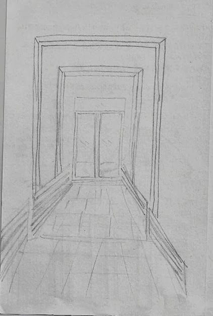
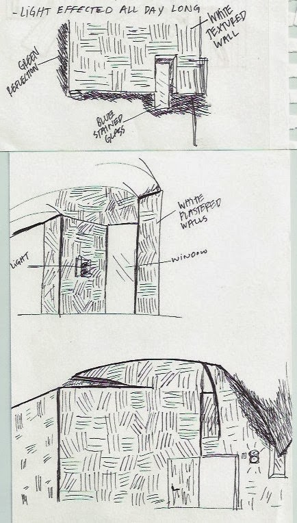
Throughout this course I have learned a number of new skills and have grown exponentially as a designer. Through weekly sketches, scalise renderings, and the projects completed during the semester, I have learned how to accurately draw freehand sketches, master perspectives, and render materials and communicate ideas with the use of rendering, . I feel that I have improved my freehand sketching ability and the idea of freehand sketching is not as intimidating as it used to be. By completing sketches weekly, repetition has pushed me to learn how to sketch faster and in the right perspective with everything in proportion - a weakness I strived to improve. Some weaknesses I have come across while sketching is the first initial step when beginning a sketch and drawing the view from exactly where I am standing. I tend to draw the space too small as if I were viewing the area from further away, or vice verse. Through weekly sketches and the scalise renderings, I feel more confident in rendering and enjoy the rendering process. I have learned how to incorporate different medias and how to blend them together to crate an overall better rendering. A  challenge I come across frequently is the process of finding the right colors and mixing them to create the desired color or material. Along with the journals, the three projects were also beneficial for improving sketching and rendering. The process of creating the layers such as the grid, boxes, and furniture within the boxes, has made me feel confident in drawing accurate perspectives. Repeating those initial steps for each project was very important because as I continue in design, perspectives will become a very common thing I will come upon and I will be able to draw them quickly and correctly. It also taught me how to view spaces in multiple perspectives because the space can seem completely different from a different view. A weakness I have through this process is picking which perspective I should draw from and having an idea of how it will turn out in the end. Although I run into these challenges throughout the process of creating a perspective, I have improved my ability to draw an accurate perspective by a great deal now that I understand the process. I also learned how to use digital graphics to improve a hand drawn perspective. My Photoshop and InDesign skills have improved as well while completing the composite drawing. Overall, I have grown as a designer over the period of this course and am improving the skills that are necessary to have.


Friday, October 25, 2013

Habitat for Humanity

On Saturday October 19th, I had the privilege to work on a job site for Habitat for Humanity. Over the eight hour period we had at this job site, we learned how to tie hurricane ties, put on the beginning stages of roofing as well as put up the drip edge, and dug dirt away from the foundation. We hammered nails into pieces of wood that were needed for insulation and other elements that were going into building the house. The men on the job site taught us safety precautions for being on a job site as well as how to properly do these activities. 

This experience was very beneficial because as an interior designer, it is very important to understand the underlying concepts of construction in order to design accurately and realistically. Learning about all of the steps that goes into constructing a roof such as the beams, the plywood, the drip edge, etc., is important to know as designers. During my career, I will have to visit the job site that I am designing in which I will need to know the basic structural elements and concepts of construction. It was also helpful to see what a house looks like before it is completely done and finished. 


Saturday, October 5, 2013

Sketch Crawl


The sketch crawl activity we participated in at the Seattle Center was fun and enjoyable because we were given the chance to sketch whatever we wanted all on our own. It was interesting to take all of the skills we have learned so far in regards to sketching and then go out into the field and apply those skills. Having the professionals there with us to see their sketches and hear their advice was very beneficial because there is always so much room to grow as sketchers. Sketching in the field is an important skill to have because when on a job site or with a client, it is vital to be able to sketch everything accurately and quickly because visual communication is the most successful. Some strengths I have as a sketch artist is being able to look at a space and visually represent it without confusion or misrepresentation. On the other hand, as a beginner sketch artist I have a few weaknesses that I plan to work on to improve. When beginning to sketch an area, I have a hard time with the initial start of the sketch because I never know where to start. I also have a hard time with scale and proportion, a reason why I tend to zoom in too far and not get the entire picture on my page. Although sketching is not one of my design strengths, practices such as field sketching is very valuable and important to me because it helps me improve and get better at a skill that I will need to master when becoming an interior designer. 


Job Shadow

For my job shadow, I attended Dawson Design Architects in Seattle. DDA is a high-end firm that designs hotels internationally and currently has an office in London. DDA is a hard working environment that uses “the struggle” model, which weeds out designers who are not up for the challenge. The firm is known for it’s smart and savvy tactics used to save money, their highly creative designers, their distinct interiors, which all result in long-term clients. An interesting aspect of DDA’s design was the fact that everything they use is custom made and their own which shows another dimension of their creativity. I found this job shadow to be very eye opening and valuable because they expressed the importance of a unique and outstanding portfolio that stands out as well as a hard work ethic. After experiencing the job shadow, I have decided to change my work ethic and have decided to put more effort into all of my work because when applying to jobs, no matter where it is, I will be compared to everyone else with the same desire but even from other schools who may have a higher rating. Thinking about being compared to anyone and everyone across the country, I have learned to put all my effort into each project and assignment I do because it will make me a better designer. Another thing I retained from this job shadow experience was the need to know how to work fast and work on multiple projects at once. This experience was an extraordinary experience to see what the real world looks like and the possibility of designing for global hospitality.

Frye Art Museum


The Frye Art Museum, located in Seattle, used to have a very uninviting, unwelcoming entry that was not working in their favor. The architect wanted to create an entrance that was rather a visitor’s experience in which incorporated a sequence of entries rather than what was previously considered their entry to the museum. The new entrance consisted of a water pool that was very calm, which relates to the environment of a museum, and a ramp that implied everyone is welcome and everyone is to use the same entrance. With the use of the ramp for the entrance, everyone can experience the same entry the same way. The use for the doors that are incorporated at the entrance to the building was described as “gates of knowledge, intellectuals, and art.” The entrance, exterior and interior, are both very well lit and open to daylight. The experience throughout the museum would be much more inviting during the day because of the use of daylight and openness that the natural light provides. The interior entrance, which consists of a dome ceiling with a light hole at the top, brought the most of my attention to the design. When standing underneath the light hole at the top of the half sphere ceiling, it is a sense of organization and direction without the museum as if you are to look straight, left, or right, you can see the three different paths there are to take once you enter the museum. I found this site visit interesting because it really emphasizes the importance of daylight in any space, not just a museum, although it is critical to incorporate it in museums to keep the people interested and not bored.

Street Bean Espresso and Shelter


The teen shelter along with the Street Bean Espresso, located in Seattle, was an eye-opening site that broadened my horizons as a designer. The shelter across from the espresso shop is a comfortable place where teens that live on the street can come and hangout. These teens who live on the streets are kids from ages as young as thirteen years old to twenty-two years old that feel as if the streets are safer than their home. The space currently accommodates teens from 10am to 12pm and 7pm to 9:30pm and allows teenagers to do laundry, shower, use the restroom, eat, and hangout in a friendly environment. Currently the area is a little disorganized and not as welcoming as they desire it to be. After speaking with the woman who is in charge of the shelter, some ideas in order to improve the space were surfaced. An important idea that came across my mind was to change the front of the building to a more welcoming entrance, although the presence of an obvious sign announcing it is a teen shelter may not be ideal, a friendlier and more comforting entrance would encourage teenagers to come more often. Another idea that was brought up by the administrator was the idea of five floors of apartments upstairs in which would be affordable for the kids who have no other place to live. Since the objective of this shelter is to train them and provide them with valuable skills in order to earn money and move on with their life, the space should incorporate a much similar environment as to the espresso street across the street. By allowing teenagers to work at the espresso shop to learn those skills that can be used in the work force, that same idea can be used throughout the shelter to provide them with the knowledge that there are other ways of living which will motivate teenagers to get off the streets and start their life in the right direction. I valued this site visit more than I expected because it showed other areas in which design is incorporated and that there are many different environments in which it is needed.

Friday, October 4, 2013

Chapel of St. Ignatius

 
The Chapel of St. Ignatius, located on Seattle University’s campus, was an interesting and very insightful experience, especially in regards to the use of light. The process of this design was interesting to hear because it related directly to what we are working on in class – concept development. The idea of looking into the writings of St. Ignatius and pulling the concept of ‘7 bottles of light in a stone box’ is directly represented in the exterior architecture and interior of the building. The use of lighting throughout the building is outstanding and is what makes this chapel so intriguing. With daylight being such an important aspect of the design, visiting the chapel during the day rather than the night is a completely different experience with the light shining through the certain areas of the building. The interior of the building being pure white plaster walls allows the light to reflect off the wall while also providing areas of shadows. With these areas of shadows, the interior of the building successfully represents the stone box, the concept of this project. The colored glass windows was an aspect that drew my attention the most because of how creatively it brings color to the white interior without bombarding the concept or the aesthetics of the interior.  

325 Westlake


325 Westlake building is located in Seattle in South Lake Union District. This re-use construction project will include an art-gallery downstairs that will feature local artists and will accommodate 12 separate apartments above the gallery. The twelve units consist of a one-story apartment that will be ADA livable, loft-story apartments, and a penthouse suite on the 5th floor with luxurious views of the city as well as South Lake Union. The tour throughout the building was a phenomenal experience because it was eye opening to see all of the work that is put into a design project. Knowing that there are multiple stages throughout the process, such as the building and construction stage in which we were able to experience, is an important aspect of being a designer. I found this site visit to be the most beneficial tour of the trip as it was informational to speak with someone who is a part of the job but also to see the underneath of a project. Some aspects of their design that stood out to me were the use of split heating in every unit which requires less energy to be used, all utilities ran underneath the floor, and everything is isolated to eliminate sound between each units. I found the isolation to be very important to me as a designer because while designing for a commercial area such as an apartment complex or even a residential area, it is important for each room or space to accommodate certain people or needs without interfering with others' personal space.

zHomes


            The zHomes, located in Issaquah was a beneficial site to visit because it enriched my thinking of ways to design sustainably and environmentally. The type of materials used throughout the homes and the amount of heat and energy that was saved throughout the design was incredible and something I was not fully aware of. Some of the most important aspects of the design that I retained were the use of reused materials such as the countertops made of recycled pickle barrel as well as the wood having FFC credit, meaning not deforestation or illegal. I also found the use of thicker walls to reduce need for heating was a tactical way of reducing the amount of heat used. Something I found interesting about the space was how small it was but how efficient everything was organized. The zHome proved to me it is possible to accommodate living in a tight space without feeling crammed. Their use of colors was also an interesting aspect of their design as the colors were neutral and earthy, which related to their concept of a sustainable design. I also found it interesting and informational that the owner of the home can use the device that is provided to understand and watch how much energy they are actually using and etc. The site visit was very beneficial because of how important designing environmentally is now and will continue to be in the future.

Sunday, September 22, 2013

Ride, Don't Walk


This exercise was very beneficial because it put me in the shoes of someone who is in a wheelchair and has to navigate through challenging areas that are not specifically built ADA accessible. These complications, such as small door openings and hard surfaces to wheel on make it frustrating to go throughout your day like anyone would normally do so. Doing this exercise, I found many complications and found it very frustrating when I could not enter entry ways easily, such as bathroom openings, elevators, and bathroom stalls. Even wheelchair accessible bathrooms were complicated to navigate in because of the how the doors open. I enjoyed this experience in a way because it allows me to keep in mind these troubles I had while designing for people in wheelchair because without being able to put myself in their shoes, I would not fully understand the complications people go through daily as they navigate around.

An area I really struggled with were the bathrooms and the ramp in Daggy hall on the ground floor. The ramp is designed without a landing area on the top, so once you open the door you go flying down the ramp, making it hard to break and slow down. It's a little scary when going down the ramp because you feel as if you have no control. Also, on the way out, it is almost impossible to go up the ramp because the handicapped button to open the door is about half way up the ramp and you have to hold yourself up while quickly reaching for the button, feeling as if you are going to fall backwards or roll back down the ramp. The ramp is so steep it's hard to hold yourself up and balance yourself while waiting for the door to open and then using all of your arm strength to get through the entrance before the door closes. A few other complications I found in Daggy were the bathrooms, as there is only one wheelchair accessible one which was still hard to navigate in because the door opening is not big enough enter through, as well as opening the door and holding it open while wheeling through it was very hard. The elevator was also very small for a wheelchair, once you entered it, there was not enough room to re-situate yourself in order to wheel out facing forward when it was time to exit. Uneven ground surfaces was another problem I had during this exercise. Outside of Carpenter Hall the pavement is uneven near the wheelchair ramp; ironic. There is so much of a lip between the two concretes I almost could not get over it. There were also complications such as: opening cabinet doors because I would be in the way of opening the doors, ordering at the coffee shop it was hard to reach the upper area to pay and see the person I would be speaking to order my drink, and small areas to navigate around as going into bathrooms the little wall in front of the doors made it just another thing in the way. This experience made me feel empathy for people who are in wheelchairs and was a very beneficial and informational activity. I think it is very important every designer takes part in an activity like this in order to design with them in mind on a more personal level.

Monday, August 26, 2013

Personal Sense of "Home"


Above is a photo of quick sketches I drew in class if what I believe home represents. Home to me is a comforting expression because my family makes me feel loved and wanted. Home in general is a mirror of self and my home is a perfect reflection of my family and I. I drew a heart because my family is very close and we all care for one another. The sketch of music notes resembles constant music playing at my house and the feeling of relaxation and comfort. Every home has something different that displays who a family is, inside and out. My backyard is a big part of what home reminds me of, as my parents are big on gardening. I drew the garden and a vine of peas because almost every cooked meal we have at home, at least half of what we are eating is from our gardens in our backyard that we grow ourselves; such as peas, potatoes, tomatoes, squash, cucumbers, etc.
What makes me feel at home is the constant laughter around my house, which can sometimes be heard from a few houses down when my mom laughs because of how loud her laugh is. My home is always a positive feeling and because we like to have people over a lot of the time, it is a very social environment. To me, home as a social environment displays the family as an open group of people who allow friends and neighbors into their life. Barbeque's are a common event at my house that makes me think of the word home, and backyard activities such as volleyball, bad-mitten, and passing the football or soccer ball. Home to me is a resemblance of who that family is and my family is very clearly demonstrated throughout our home.

Tuesday, April 30, 2013

Graphic Reflection

Graphic Reflection I created a poster to summarize my design journey throughout this course by using InDesign and PhotoShop. I used PhotoShop to alter the size of the photos and create a background, and then used InDesign to create the poster. The first body of texts summarizes my reflection of the course and my work while the others summarize each piece of work I placed on my poster. The large plan oblique was a part of my drafting project I did by hand, the four sketches are four of my best sketches I chose from my sketch journal, and the other project is a brief look at my tessellation project. Something I found challenging when working on my poster was working with layout and color. I feel as if I executed layout and color effectively after multiple rough drafts. This project helped me understand the importance of layout and color as well as using InDesign and Photoshop. 

Sketch Journal

 
Figure Contour Sketches This sketch was my initial sketch in the beginning of the year and challenged me to draw using contour lines and learning how to sketch freehand. I found this sketch difficult because it was my first sketch and learning how to draw with straight lines was difficult as it is easier to draw using multiple lines. This sketch required me to focus and only use one stroke which produces a more aesthetically pleasing product.


 Tessellation In Nature   Above is a sketch of three examples of tessellation in nature. I found this sketch fairly easy as I am an observant person and notice tessellation in nature everyday. The challenging aspect of this sketch was learning how to repeat the same shape multiple times without manipulating the shape.

Cross-hatch Fruit The objective of this sketch was to draw fruit on a table using cross-hatch shadowing. I found this sketch fairly enjoyable because I enjoy cross-hatch shadowing. This sketch was helpful in teaching me how to draw real-life objects and applying shadowing by using this certain drawing technique.


Actual Chair Negative Space The above sketch was intended to teach us to draw a chair using negative space. Instead of drawing the chair using positive space and leaving the background white as negative space, this sketch challenged us to draw the negative space as positive space. I found this sketch difficult because it is abnormal and different and it was hard to visualize the chair as negative space rather than positive space. 


Chair Views The purpose of this sketch was to observe a chair in five different perspectives and then draw it to communicate different views. I found this sketch helpful to teach myself to observe an object from different view points and be able to sketch it accurately. I found this sketch fairly challenging because it was hard to draw the actual size of the chair. 


Napkin Sketch The sketch above is the floor plan and elevation sketch of my dorm room. It was drawn on a napkin and was drawn with a felt pen. I found this sketch challenging because it was the first floor plan I had ever drawn and the first elevation drawing I drew. I found it challenging because it was hard to draw the elevation while looking at the room as I was in it. This sketch helped me teach myself how to draw the room as if I was looking at it from an elevation rather than standing within it.


 Shade and Shadow of Interior Corner of Room The sketch above is a corner of a room using shadowing and shading to communicate depth and true perception. This sketch went well for me because I have improved with two-point perspective drawing and feel fairly confident in drawing in this perspective. I used cross-hatch shading in the corner to demonstrate shadows and space.


 Room Value Study This sketch was to first draw an area as it was using line weights to show the value of the space, and then draw the area to show the change in value in the space using high contrast methods. I found this sketch challenging because it is an unusual way of viewing a space and is harder to draw compared to drawing it just as it is. This sketch was helpful in teaching me how to draw a space using high contrast methods which is a new technique I learned throughout this course.


Black Paper  This sketch above was drawn on black paper using media such as a white colored pencil. The final sketch was different compared to the other sketches and was intended for me to show textures with the use of drawing techniques and media application as well as create the illusion of depth through the use of overlapping and observation of angles. This sketch was challenging because it was completely different and I found it difficult to express texture while using a colored pencil on black paper. I feel as if I executed the perception of depth and texture as well as I could and I found this sketch entertaining because of how different it was compared to the previous sketches. This sketch taught me to use different media applications and it's difference in communicating ideas.

Wednesday, March 20, 2013

David Kutsunai | IA Architects


David Kutsunai (IA Architects) uses the process known as an Integrated Design Process that involves every expert, such as the engineers, mechanics, contractors, the client, and more, in the same room at the same time to come to consensus on ideas. By doing this process, the amount of mistakes, time, and money is reduced. With projects such as the headquarters and campus for Amazon.com, the Russell Investments Center, and the 601 4th Avenue Triad Development, the office building of the future is much more efficient with a large reduction in energy use and is successful in creating a work area designed for a business rather than the business having to adapt to a workplace.

Monday, February 25, 2013

Tessellation

This tessellation is created from American Vernacular photos that were manipulated and altered in ways that made the images unrecognizable. The photos were manipulated in photoshop using a variety of tools such as picture effects and color replacements that distorted the images, and then added to InDesign to create a tessellation. I liked changing the pictures and applying effects to them, but found it difficult to reach a color harmony in the end. It was fun to distort and manipulate the images in photoshop and learning how to use this program as it is very challenging in the beginning but very fun once things are figured out.