Wednesday, April 16, 2014

STIR - A Resource for Color and Creativity

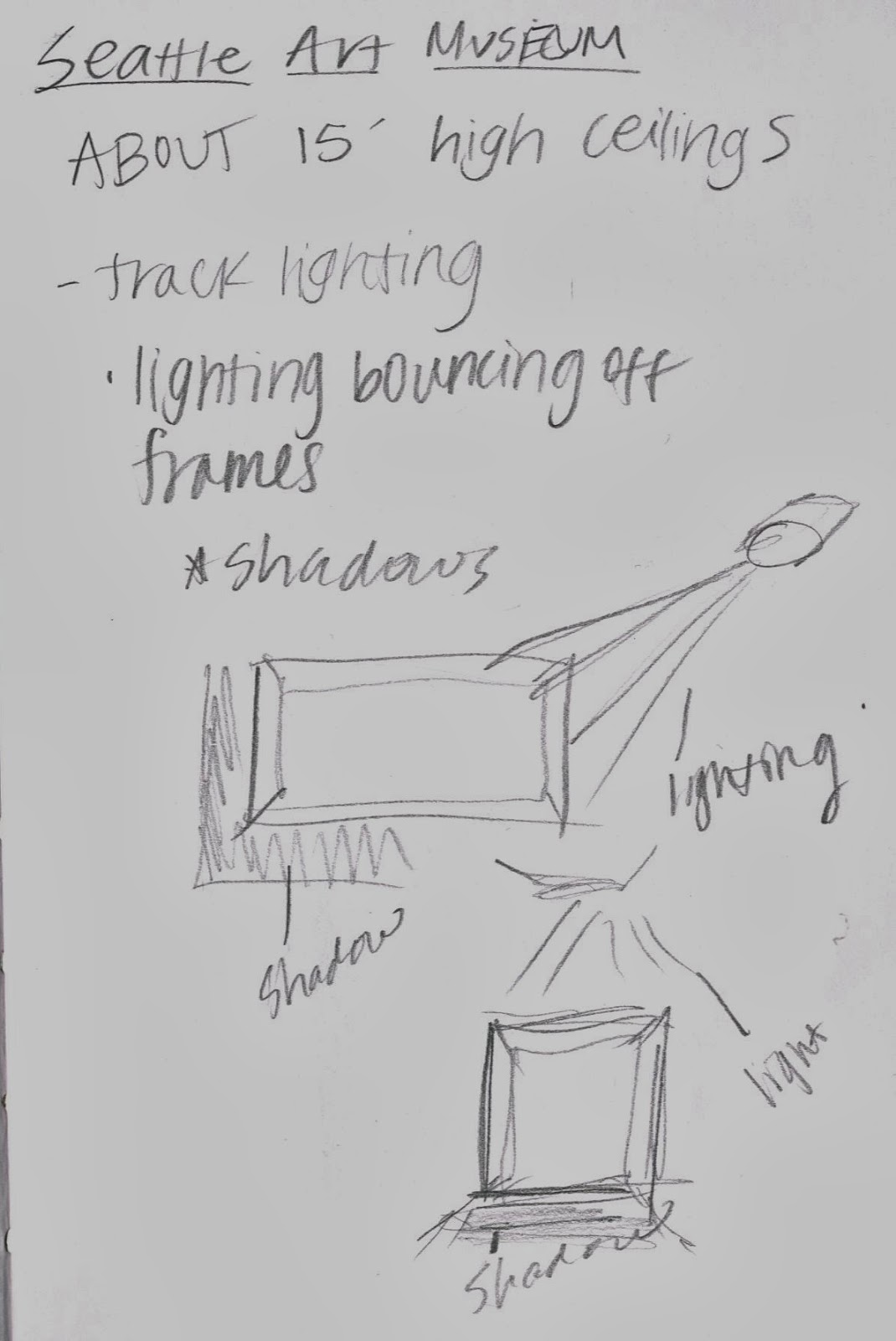
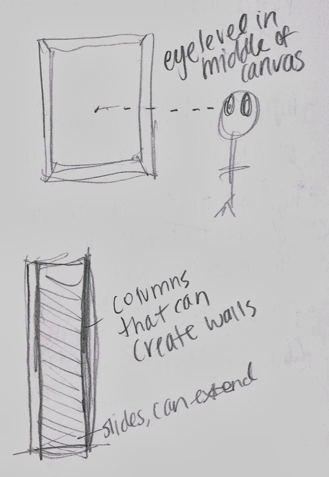
The STIR competition, provided by Sherwin-Williams, incorporates using three different Sherwin-Williams colors throughout an interior space and being able to render them correctly to learn the importance of successfully communicating ideas and color through hand rendering and digital rendering. The commercial interior space focuses on an art gallery for a local Pacific Northwest artist and is universally designed, as well as ADA accessible. The concept used throughout the gallery is derived from the Northern Pacific Railway logo, resembling the structure and strength of the railway. Railroad tracks are seen as sturdy, strong, and encompasses straight, strict lines that are complimented by the circular motion from the train wheels and the motion of travel that is circulated around a train station. The Depot in Pullman, Washington withholds many of these qualities, with the additives of structural beams that resemble the train tracks with wood as the material used throughout the gallery because of its longevity of a lifetime, strength, and aesthetics. The colors implemented in the design, a deep red, dark blue, and a bold oatmeal, are taken strictly from the idea of strength and durability from the logo and the concept of the train tracks. Deep red and dark blue can be seen as dark, bold colors, as the oatmeal color provides a lighter aspect to the interior to balance the dark colors. This STIR competition was beneficial in many aspects, such as learning how to correctly render the colors of the interior to successfully communicate ideas to the client when presenting a design. This project taught me also how to implement my 2D design into 3D design for a commercial area, such as an art gallery that must incorporate style and concept without overpowering the artwork. 

Friday, March 28, 2014

Museum Visit

Visiting the Seattle Art Museum was very insightful and helpful for successfully designing a gallery space. The assignment to complete over Spring Break required students to visit a gallery/museum space to observe, take notes, pictures, and gather useful information that will benefit our designs. For my museum visit, I chose to go to the Seattle Art Museum in downtown Seattle, WA. I decided this museum because I am familiar with it and have always had a positive experience while visiting different exhibitions. Throughout the different exhibits, I observed the different lighting techniques and materials as well as general space planning that included space between pieces of art to allow viewing, circulation patterns, and space dividers.
I gathered many important aspects of gallery design such as different lighting techniques and angles that will be depend on which kind of art is displayed and the colors in that specific piece. I noticed that paintings with lighter and brighter colors had the light directed right on them which lit up the piece and gave it more light to enhance the bright colors of the painting. On the other hand, darker paintings, especially ones with intended shadows in the painting, the light was not directed on it so the light did not take away that certain feel and purpose of a painting. I also took away the importance of movable lights and how different angles will produce different shadowing and effects, such as when it is directed on the painting from strictly above, it produced shadows directly underneath the painting, and when the light is angled and shining on the picture at an angle, it produced shadowing on the opposite side of the painting and the bottom of the painting. I also gathered information such as movable walls not reaching all the way until the ceiling, leaving about two feet of space between top of movable wall and the ceiling, a 12'-15' gallery hallway to incorporate walking area as well as viewing for both walls that may display paintings. About 5'-6' of viewing space for a painting was also common as well as the use of columns that can create walls to divide and separate space.

Monday, March 3, 2014

Concept Development


Concept Development is one of the most important phases of the design process. For the Pufferbelly Project, my inspirational object is the Northern Pacific Railway logo. Throughout the concept development process, I explored the elements of line, strength, contrast, and travel. All of these words are derived from the logo and the concept of the train station and the train tracks themselves. With these elements and principles of design, I created my parti sketch (top middle) which then was rotated and flipped multiple times to create a textile pattern (top right). Using the parti as inspiration, I created a 3D model to represent strength with the use of wood as the material, red and black to demonstrate contrast and resemble the logo, and line and the concept of travel with the demonstration of straight lines and curved lines. Throughout this process I learned how to adapt to more abstract thoughts and objects and create a successful parti and model that can be incorporated throughout the actual design. The concept development process is challenging to me but I can tell I have improved by my use of using an abstract logo and abstracting it more and taking a different pathway using straight, structural lines which are different than the round, circle logo.

Monday, February 3, 2014

Habitat For Humanity


This project for Habitat for Humanity started with interviewing the builders of Habitat and studying typical Habitat houses, to then create a home for a family of five that would be ADA accessible on the first floor. With Habitat as a typical small house, it was a challenge to fit all of the needs within the square footage while also including the specifications for ADA accessibility throughout the first floor. As a team, we created a floor plan, chose materials that fit Habitat's criteria, built a model, created and rendered perspectives to communicate our ideas, and then designed a poster to fully execute and display our design. This project taught me how to design within certain parameters such as small square footage, meeting criteria, and working with a team in terms of collaborating ideas, staying flexible, and completing all of the tasks. This project also gave insight into working quickly with a team, and having to stay on top of things in order to get things. It progressed my thinking as a designer and challenged me to think and design quickly which will benefit me in the long run throughout my career.