 Visiting the Seattle Art Museum was very insightful and helpful for successfully designing a gallery space. The assignment to complete over Spring Break required students to visit a gallery/museum space to observe, take notes, pictures, and gather useful information that will benefit our designs. For my museum visit, I chose to go to the Seattle Art Museum in downtown Seattle, WA. I decided this museum because I am familiar with it and have always had a positive experience while visiting different exhibitions. Throughout the different exhibits, I observed the different lighting techniques and materials as well as general space planning that included space between pieces of art to allow viewing, circulation patterns, and space dividers.
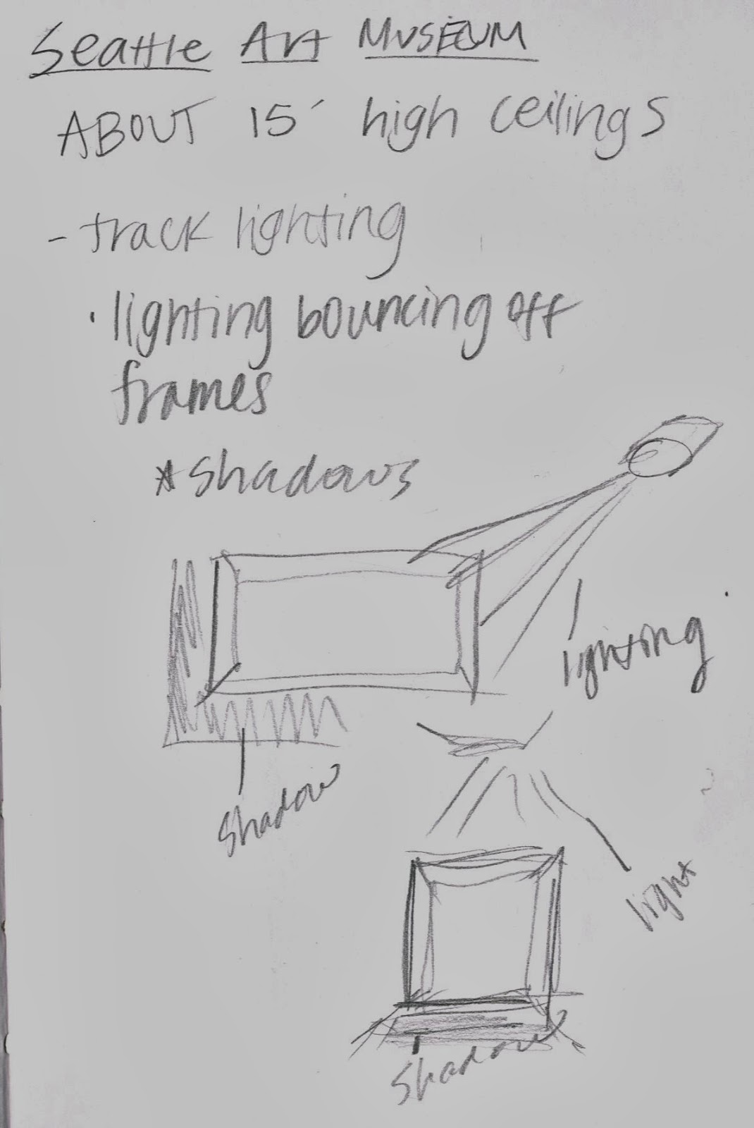
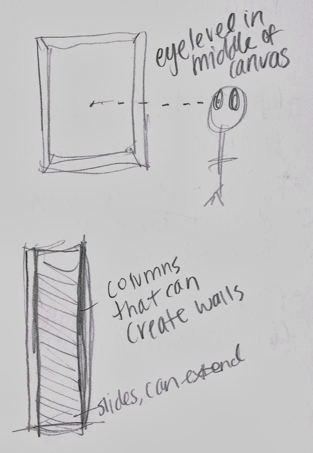
 I gathered many important aspects of gallery design such as different lighting techniques and angles that will be depend on which kind of art is displayed and the colors in that specific piece. I noticed that paintings with lighter and brighter colors had the light directed right on them which lit up the piece and gave it more light to enhance the bright colors of the painting. On the other hand, darker paintings, especially ones with intended shadows in the painting, the light was not directed on it so the light did not take away that certain feel and purpose of a painting. I also took away the importance of movable lights and how different angles will produce different shadowing and effects, such as when it is directed on the painting from strictly above, it produced shadows directly underneath the painting, and when the light is angled and shining on the picture at an angle, it produced shadowing on the opposite side of the painting and the bottom of the painting. I also gathered information such as movable walls not reaching all the way until the ceiling, leaving about two feet of space between top of movable wall and the ceiling, a 12'-15' gallery hallway to incorporate walking area as well as viewing for both walls that may display paintings. About 5'-6' of viewing space for a painting was also common as well as the use of columns that can create walls to divide and separate space.


