Figure Contour Sketches This sketch was my initial sketch in the beginning of the year and challenged me to draw using contour lines and learning how to sketch freehand. I found this sketch difficult because it was my first sketch and learning how to draw with straight lines was difficult as it is easier to draw using multiple lines. This sketch required me to focus and only use one stroke which produces a more aesthetically pleasing product.

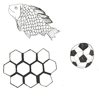
Tessellation In Nature Above is a sketch of three examples of tessellation in nature. I found this sketch fairly easy as I am an observant person and notice tessellation in nature everyday. The challenging aspect of this sketch was learning how to repeat the same shape multiple times without manipulating the shape.
Cross-hatch Fruit The objective of this sketch was to draw fruit on a table using cross-hatch shadowing. I found this sketch fairly enjoyable because I enjoy cross-hatch shadowing. This sketch was helpful in teaching me how to draw real-life objects and applying shadowing by using this certain drawing technique.
Actual Chair Negative Space The above sketch was intended to teach us to draw a chair using negative space. Instead of drawing the chair using positive space and leaving the background white as negative space, this sketch challenged us to draw the negative space as positive space. I found this sketch difficult because it is abnormal and different and it was hard to visualize the chair as negative space rather than positive space.
Chair Views The purpose of this sketch was to observe a chair in five different perspectives and then draw it to communicate different views. I found this sketch helpful to teach myself to observe an object from different view points and be able to sketch it accurately. I found this sketch fairly challenging because it was hard to draw the actual size of the chair.
Shade and Shadow of Interior Corner of Room The sketch above is a corner of a room using shadowing and shading to communicate depth and true perception. This sketch went well for me because I have improved with two-point perspective drawing and feel fairly confident in drawing in this perspective. I used cross-hatch shading in the corner to demonstrate shadows and space.
Room Value Study This sketch was to first draw an area as it was using line weights to show the value of the space, and then draw the area to show the change in value in the space using high contrast methods. I found this sketch challenging because it is an unusual way of viewing a space and is harder to draw compared to drawing it just as it is. This sketch was helpful in teaching me how to draw a space using high contrast methods which is a new technique I learned throughout this course.


Your interior design sketches look good. As what my friends selling retirement communities atlanta say, design plays a huge role in selling real estaet.
ReplyDeleteI went over this website and I believe you have a lot of wonderful information, saved to my bookmarks Best Windows and Doors Company Toronto
ReplyDeleteThis comment has been removed by the author.
ReplyDeleteThanks for the valuable information and insights you have so provided here... Bathroom Renovation Toronto
ReplyDelete